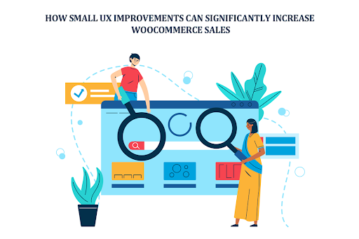
Are you losing sales without even realizing it? Ever felt like your store should be selling more, but it just isn’t? You check the traffic. It’s there. People are visiting, clicking, browsing, and then nothing. They leave quietly. No purchase, no sign. It’s frustrating, honestly. And most store owners think it is pricing or product quality. Sometimes it is but often? It’s the experience.
Table of Contents
ToggleThat’s where WooCommerce UX Improvements come in. Small things. Tiny friction points. A slow-loading page. A confusing layout. Or even poorly placed WooCommerce Banner Images that don’t guide the user anywhere.
Think of a visitor like a guest walking into a physical shop. If the shelves are messy, the signs are unclear, or the salesperson is missing, they walk out. The same thing happens online. A well-placed WooCommerce Category Banner can actually guide users like a signboard in a mall, subtle but powerful. That’s what we’re diving into: small UX improvements that don’t look like much, but they quietly increase sales in ways you didn’t expect.
Why UX Matters More Than You Think
UX isn’t just design. It’s feeling. It’s flow. It’s how easy or hard it is for someone to buy from you. And people are impatient. Very. Imagine this:
- A user lands on your homepage
- They don’t understand what you sell in 3 seconds
- They leave
Done. Gone.
Bad UX leads to:
- High bounce rates
- Confusion
- Distrust
Good UX feels invisible. Smooth. Almost effortless. Users don’t think, they move. Click. Add to cart. Checkout. That’s the goal. Even small tweaks, like adjusting WooCommerce Banner Images or cleaning up clutter, can shift behavior. It’s not magic. But it feels like it.
1. Improve First Impressions with Strategic Banners for WooCommerce UX Improvements
First impressions hit fast. Like, really fast. Users don’t “explore” anymore, they scan. Imagine a visitor lands on your store during a sale. But there’s no clear banner. No message. No urgency. They scroll a bit. Then leave. Now imagine instead:
- A bold banner saying “50% OFF Today Only.”
- Clean visuals
- Clear direction
That’s where WooCommerce Banner Images shine. They speak instantly, no effort needed. Also, don’t ignore category pages. A well-designed WooCommerce category banner can:
- Highlight deals
- Reduce confusion
- Push users deeper into the funnel
Keep it simple, though. Too many banners? It gets noisy. Users hate noise.
2. Simplify Navigation for Faster Decision-Making
Confused users don’t buy. Simple. Navigation should feel obvious. Like walking in a store with clear aisles. Bad navigation feels like:
- Too many menu items
- Weird category names
- No search bar
Good navigation?
- Clean menus
- Logical structure
- Easy filters
Think less. Click more. That’s what you want users to do.
3. Optimize Page Load Speed
Speed kills or saves. Depends which side you’re on. A slow store feels broken. Even if it’s not. User clicks → page takes 4 seconds → user leaves. That’s it. To fix:
- Compress images
- Use better hosting
- Remove junk plugins
Fast sites feel premium. Slow ones feel cheap. Harsh, but true.
4. Enhance Product Pages for Clarity and Trust
This is where decisions happen. The product page. The moment of truth. Imagine a user ready to buy, but:
- The images are blurry
- Description is confusing
- Price isn’t clear
They hesitate. And hesitation kills conversions. Instead:
- Use clean images
- Add zoom
- Write like a human, not a robot
And yes, banners help here too. A small WooCommerce Banner Images section saying “Free Shipping” or “Limited Stock” can push users over the edge.
5. Make Call-to-Action Buttons Stand Out
Your button matters more than you think. It’s not just a button. It’s the decision point. Weak button:
- Small
- Blends in
- Says “Submit”
Strong button:
- Big
- Contrasting color
- Says “Buy Now”
Users shouldn’t search for it. It should be obvious. Almost shouting… but not annoying.
6. Reduce Cart Abandonment
art abandonment is painful. You almost had the sale. Almost.
User adds product → goes to checkout → disappears.
Why?
- Unexpected costs
- Complicated forms
- Trust issues
Fix it by:
- Showing the total price early
- Keeping checkout simple
- Adding trust badges
You can even use banners here. A subtle one. Maybe:
- “Secure Checkout”
- “Money-back guarantee”
Small reassurance. Big impact.
7. Use Visual Hierarchy to Guide Users
Not everything should look important. Users scan, they don’t read everything.
Guide their eyes:
- Big headlines first
- Important sections highlighted
- Clean spacing
A smart WooCommerce Category Banner can act like a spotlight. Showing users exactly where to go next. It’s like storytelling. But visual.
8. Optimize for Mobile Users
Most users are on phones now. Not desktops. That shift changed everything. If your store isn’t mobile-friendly, you’re losing sales. Period. Problems on mobile:
- Tiny buttons
- Slow loading
- Broken layouts
Fix it:
- Use responsive design
- Keep it minimal
- Test on real devices
Also, check your WooCommerce Banner Images on mobile. Sometimes they look great on desktop but terrible on phones. Happens a lot.
9. Build Trust Through Transparency
People don’t trust easily online. And honestly, can you blame them? They look for signals:
- Reviews
- Policies
- Contact info
No trust = no sale.
Add things like:
- Customer testimonials
- Clear return policy
- Secure payment icons
Even banners can help here. A small one saying “Trusted by 10,000+ customers” can shift perception instantly.
10. Personalize the Shopping Experience
Generic stores feel cold. Personal ones feel different. Think about:
- Showing related products
- Remembering user behavior
- Targeted offers
You can even use WooCommerce Banner Images for personalization, like showing different banners based on categories or promotions. It’s subtle. But users notice.
11. Minimize Distractions
Too much happening = nothing happens.
Popups. Animations. Flashing banners. It’s overwhelming. Keep it clean:
- Remove unnecessary elements
- Focus on one action per page
- Reduce noise
Your store isn’t a carnival. It’s a buying experience.
12. Test and Continuously Improve
Here’s the truth. You won’t get WooCommerce UX Improvements perfect the first time.And that’s okay. Test things:
- Change button color
- Move a banner
- Adjust layout
Watch what happens.
Sometimes, a small tweak like repositioning a WooCommerce Category Banner can increase conversions more than a full redesign. Sounds crazy.But it happens.
Conclusion
It’s not always about big redesigns or expensive strategies. It’s the small stuff. The quiet improvements. The details most people ignore. A faster page, a clearer button. Better-placed WooCommerce Banner Images plugin. A thoughtful WooCommerce category banner guides users without them even realizing it.
All these things add up. Slowly. Then suddenly, your conversions improve. That’s the power of UX. It doesn’t scream. It works in the background. Fix the friction. Simplify the journey. Make things easier. And sales? They usually follow not instantly but steadily. And that’s what really matters. Click here to learn more.